Stephen Spender Trust
Brand strategy for leader of translation in education

As leaders in the field of translation in education, the Stephen Spender Trust (SST) promotes and runs programs that enrich intercultural awareness, while raising confidence and aspiration among young people. The rebrand marks the first change to the brand’s visual elements in 24 years.
What did they need?
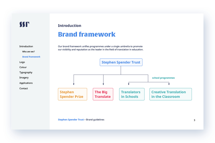
The Stephen Spender Trust wanted to recenter the brand positioning to capture the growth of its programmes under a single brand framework. At the same time, it wanted to broaden its audience from private schools to include state schools and English Language academies. A thoughtful and strategic repositioning was needed to realign their branding with their target audience, which is young people and their teachers, multilingual adults, poets and translators.

What did I do?
I created and led the brand refresh from initial concept to final delivery.
- Discover: Understand the goals and context of their unique story. Although inspired by the cultural activism of Stephen Spender, poet and champion of international literature, the organisation needed to signal its widening scope beyond its historical backdrop.
- Define: By examining the challenges that face the organisation, I defined constraints that help to promote critical thinking, prioritise requirements and minimise design dilemmas. Since the organisation has few direct competitors, I benchmarked organisations with similar values, goals and audiences to inspire and inform design directions.
- Ideate: Early concepts evolved from the constraints and were swiftly presented to SST’s leadership team. I find that everyone readily welcomes presentations that employ strong reasoning for design decisions and reinforce how the product competes in the marketplace. The concepts were refined to a single solution by actively listening to feedback and observing reactions to design iterations.
- Build: With the approval of a scalable design system, I continued to work closely with SST's leadership to roll-out the brand across touch-points and iterate on small design details. The role of the new design framework is to instruct.
- Document: The next task was to take all the elements and composite a clear set of guidelines that brought all the new elements together. This included new logo lock-ups, extended colour palettes, typographic styling, illustration guides and other graphic elements.


My approach
Over the years, I have refined my creative process to centre on those first few interactive meetings. I think it is important to make sure that an organisation thinks carefully about their project brief, so there is a common understanding with no confusion or question about what needs to be done. For this project, I worked closely with the director, Charlotte Ryland, to define a brief that clearly positioned the brand, design expectations, and provided a robust foundation for a brand audit / competitive analysis that preceded all design work.
By staggering the creative process into distinct steps, I created an opportunity to present a crash-course in branding principles alongside each creative reveal to the leadership team. This proved an outstanding success in eliciting support for feedback driven by the original brief. The result was that every idea presented was considered a success, a spirit of candid feedback based on objective reasoning, and that attention shifted to iterating design revisions as a normal part of the creative process.

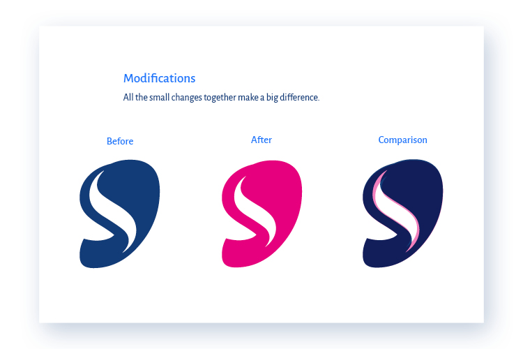

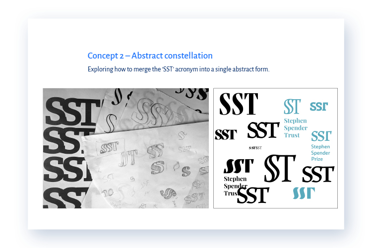
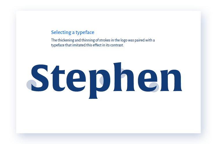
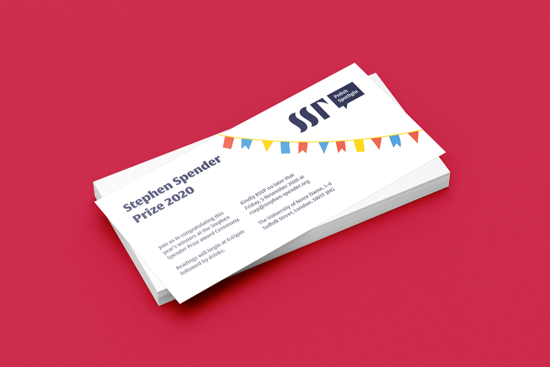
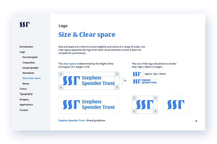
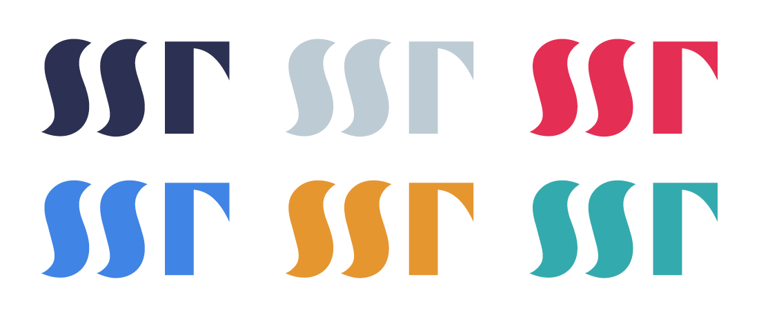
The organisation wanted a visual personality that would reflect its spirit and engage new audiences. I created a audacious monogram, that replaces the founding wordmark, with a stylized rendering of the 'SST' acronym. Conscientious use of white space liberates the type, with characters that cross boundaries and build bridges between themselves, encapsulating the spirit of Stephen Spender and his circle. It recognises the linguistic journey of translation as an art, joyfully articulated through a bright and engaging colour palette. Its abstract shapes hint at different writing systems.
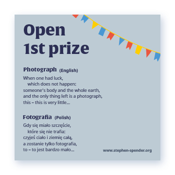
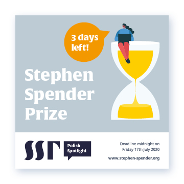
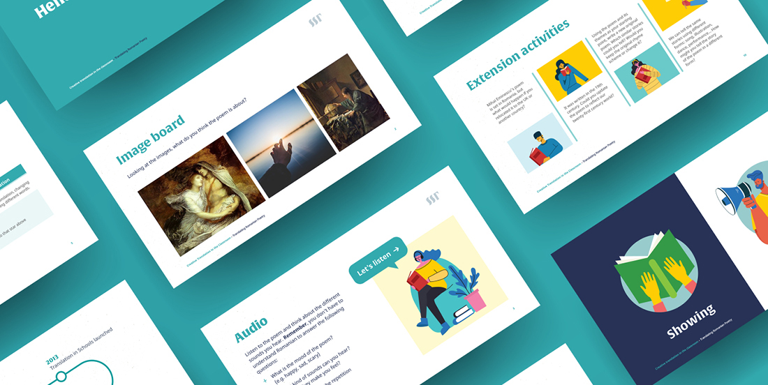
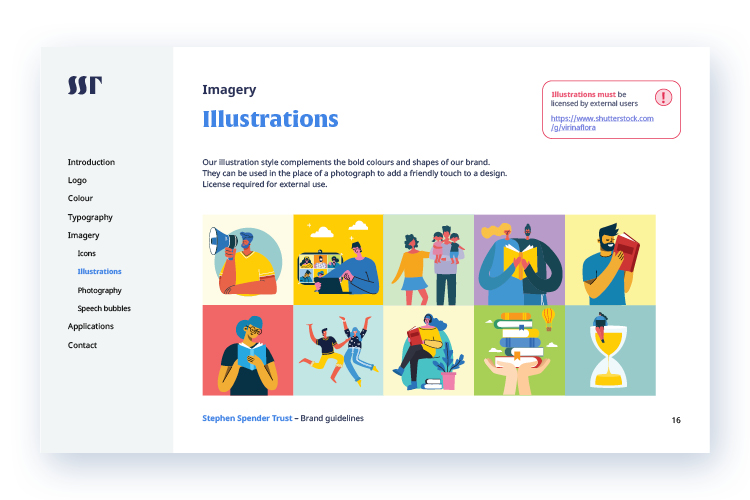
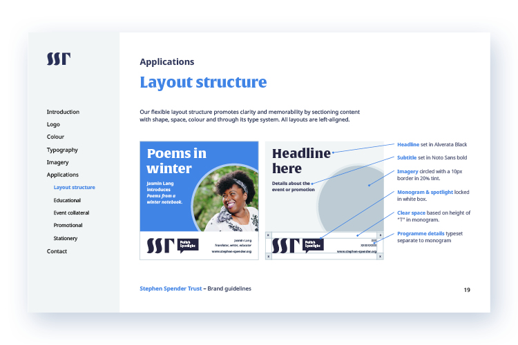
The brand system is simple but dynamic to cover uses from education programs to award ceremonies. Vibrant typography centres attention on the linguistic emphasis of the organisation, which can be customised with illustrations, photography, shapes and iconography to add a humanistic or educational sentiment. This additive approach is used across the branding, allowing the identity to modulate from practical to expressive across a variety of applications. It is highly templated to be cost-effective, enabling the internal team to create professional looking designs, at fast pace, everyday. The flexible system can be expanded easily to evolve with the organisation as it grows.