St. Bride Library
Visual identity for design and typography conference

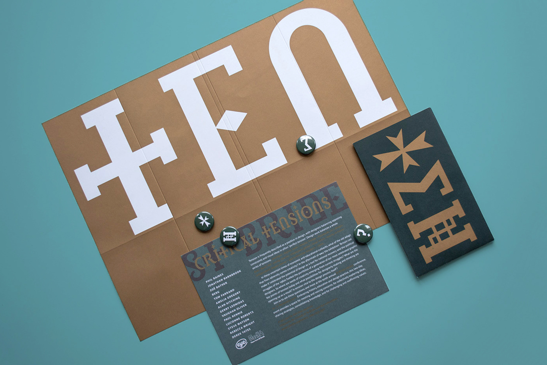
St. Bride library has one of world’s most significant collections of books about printing, typography, paper-making and graphic design. Its tenth annual conference, ‘Critical Tensions’, explores the concept of ‘perfect tension’, with speakers discussing how they balance opposing constraints and visual ideas in their creative work. The two-day event reflects on uncertain times, providing a space to discuss how creativity can thrive in adversity.
What did they need?
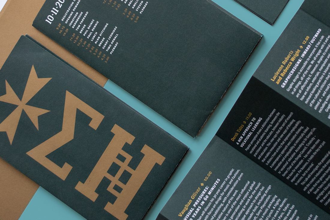
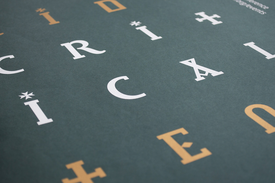
A memorable identity that embodies the conference theme of ‘tension’, fuelled by opposing relationships: colour and form; form and function; micro-macro; old-young; educated-‘feral’; designer-client. With talks that represent a plethora of typographic talent, fine typography and exquisite production process must both enrich the design and hold a central role. The identity needed to attract attention across design spheres in promotional materials, yet adapt effectively as a conference programme that informs and intrigues its audience.

What did I do?
I co-led the conference identity and design deliverables with a fellow designer, Roger Swindale, working from conception to final production.
- Discover: Critically understand the context of the conference event, such as its role in making connections with others and building community in the design world.
- Define: Examine previous work and consider expectations for outputs. For instance, how to maximise production value in promotional posters so that they double as ephemeral artwork to be sold by St. Bride Library – making a profit for the charity.
- Ideate: Early concepts evolved rapidly, exploring how to integrate the work of speakers and demo.
- Design: With the approval of an initial concept, I worked closely with my co-designer to deliver solutions across all design requirements:w posters, flyers, digital adverts, conference programme and more.
- Build: Coordinate print designs with paper merchants and printers to maximise high-quality, cost-effective output. Hand-finishing of bespoke folds was delegated to a volunteer team to reduce costs.
Key outputs
A conscientious design piece that created dialogue in the conference over social media and face-to-face, sparking design connections and a sense of community. The work featured in various design magazines across the UK, including Creative Review, Eye and Ultrabold.


