Modern Poetry in Translation
Brand refresh for tri-annual translated poetry magazine

Founded in 1965, Modern Poetry in Translation (MPT) is a literary magazine and publisher that brings the best new poetry, essays and reviews from around the world. It aims to give a voice to the silenced, exiled and excluded, and create a diverse and creative community of translators, poets and readers.
What did they need?
Under new leadership, the organisation sought to expand their readership by revitalising their identity and magazine design. While the subscription arm has always been profitable, its consumer base was shrinking, making it imperative for the publisher to reach readers who regularly buy similar titles from bookshops, supermarkets and retailers. It needed a front cover that would grab attention.
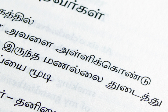
The brand had become removed from its design legacy and needed a refresh. With many translations, it was essential that content supported a wide range of linguistic requirements.
What did I do?
Working closely with the leadership, I led the brand identity with a bold new look that matches its forward-thinking content. The project includes a new editorial design for the print publication and multimedia marketing collateral. I also acted as brand guardian for the digital design of their website, developed by Surface Impression. At their fiftieth anniversary, I was invited to design a celebratory identity for events and the magazine’s front cover.
My approach
The update pays homage to the magazine's iconic designs by Richard Hollis in the 1960s and 70s, but adds a larger sense of the contemporary. I consulted with MPT on their brand strategy, looking at the history of the magazine, and other publications in its category. I revived the spirit of MPT’s design legacy through a new logotype, by modifying a contemporary typeface with the same weight and structure as the iconic sans-serif of the early issues.
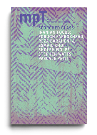
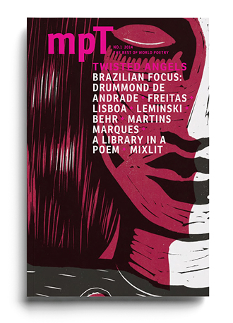
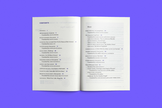
The logotype acts as a powerful masthead on the magazine front cover, contrasted by an illustrative cover art direction that commissions a fresh illustration for each issue by young international artists. To intrigue new readers, the artwork is reinterpreted with 2–4 Pantone colours, rendered as bright, saturated colours with fluorescents and metallics for special issues. Duotone colour in the text pages aids typographic hierarchy and adds interest by deviating from the conventional uniformity of the black and white page.
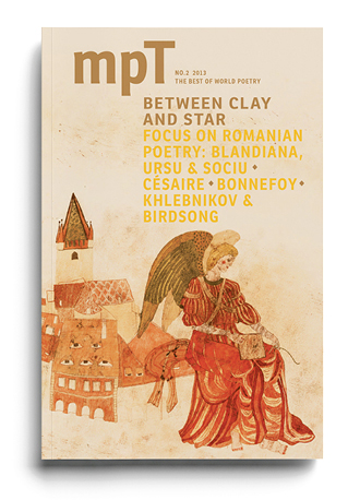
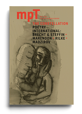
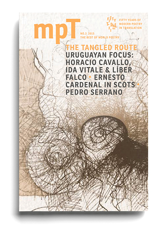
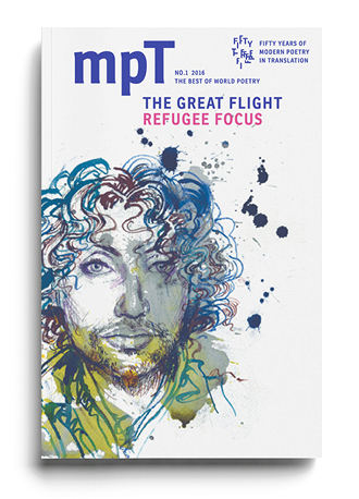
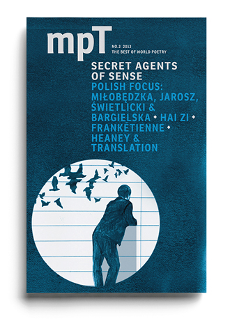
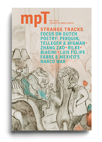
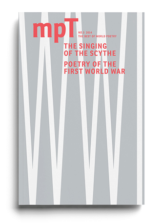
With an emphasis on economy and portability, I selected a lightweight paper has a subtle translucency that hints at the poetry of the following page, creating a sense of continuity in an environment that is, by its nature, fragmented.
Arranging verse requires a level of sensitivity to typographic details. Unlike prose, you cannot rely on a continuous flow of text to give structure to the page. Disparity in, for example, line length and poem shape, compromises the effectiveness of a conventional layout, and creates a greater focus on the layout’s ability to adapt and unify texts. The overall look of the magazine is more considerate, with a flexible layout that improves readability and minimises design dilemmas. It effortlessly typesets elegant poetry. Pull quotes and photographs can be used to break up lengthy sections of text.
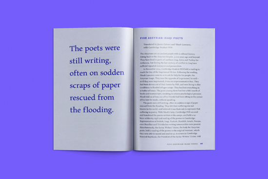
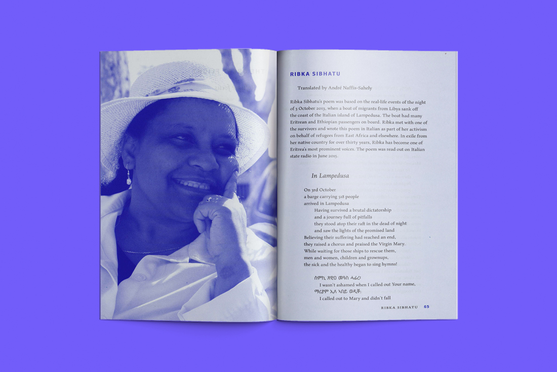
For the text face the magazine benefits from Maiola, an award-winning contemporary typeface that is both unique and economical. Its creation is inspired by the work of a Czech typeface designer, Oldřich Meinhart, whose visually distinctive typefaces were among the first to offer widespread diacritic support for languages that use the Latin script.
Key outputs
A fresh new magazine design and rebrand that builds upon a legacy of iconic designs. The publication exemplifies economical, quality print production: 2-4 pantone colours printed on translucent 60gsm bible paper with section sewn binding. The fresh edition was praised on BBC Radio 4 for its lightweight design.
