Google Fonts
Type design of over 1,000 Latin numerals for tech giant
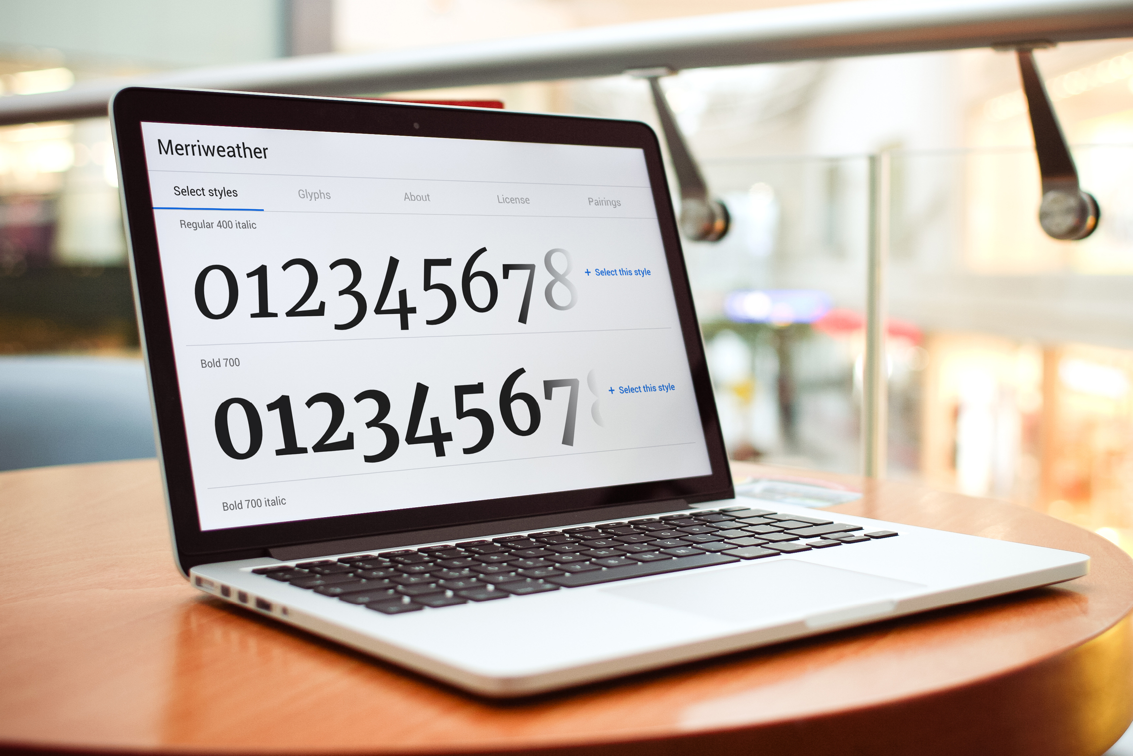
Launched in 2010, Google Fonts is a curated library of free licensed font families that played a critical role in revolutionising font-use online. Before the introduction of Google Fonts, many websites were limited to fonts available on personal computers, such as Times New Roman, known as “web-safe” fonts. The font “Merriweather” is a workhorse text type family by Sorkin Type, designed specifically for screens. It was uploaded to the Google Fonts library in 2010 and has been viewed over 431 billion times. Merriweather consistently features in recommended listings for web fonts.
What did they need?
In 2016, a new OT Variable Font technology was introduced. There are numerous benefits to this technology, including a greatly reduced file size and hence faster delivery and loading of web fonts. Google Fonts asked for the popular Merriweather typeface to be implemented as an OT Variable Font, with specific extensions to its already comprehensive character set and diversity of weights.


What did I do?
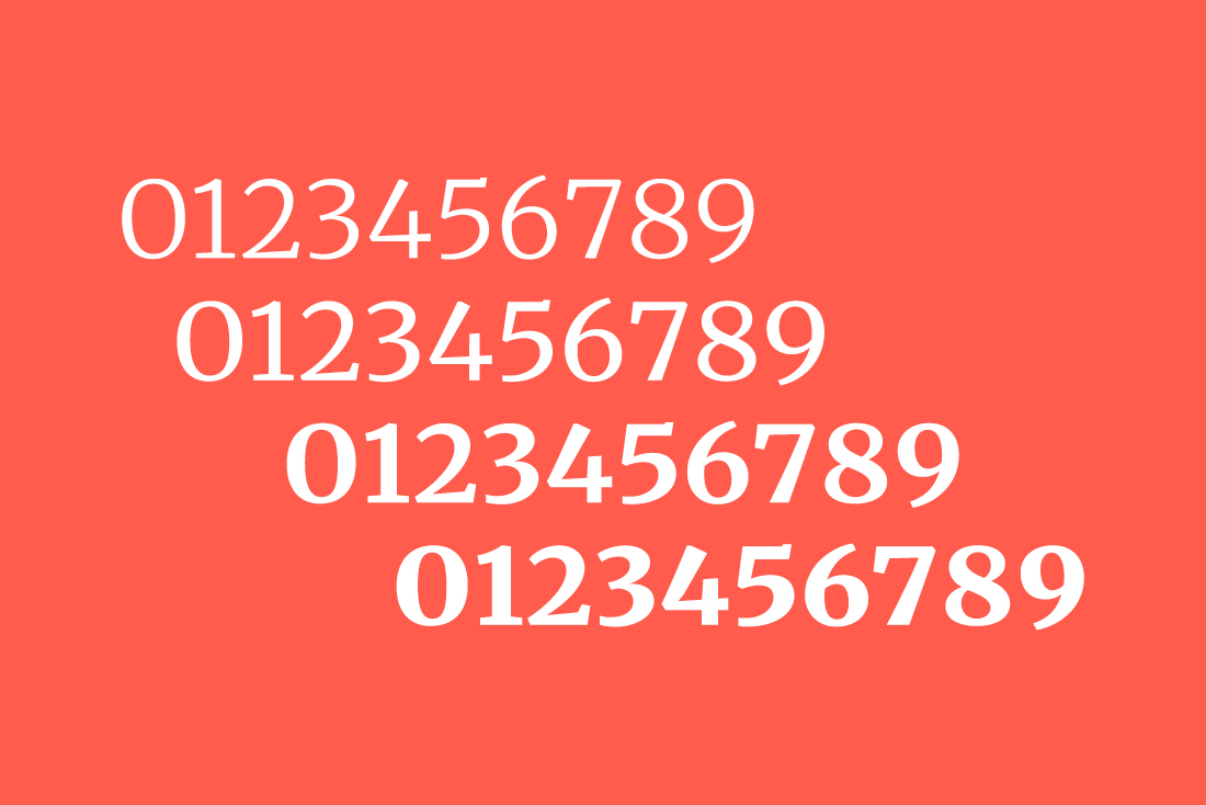
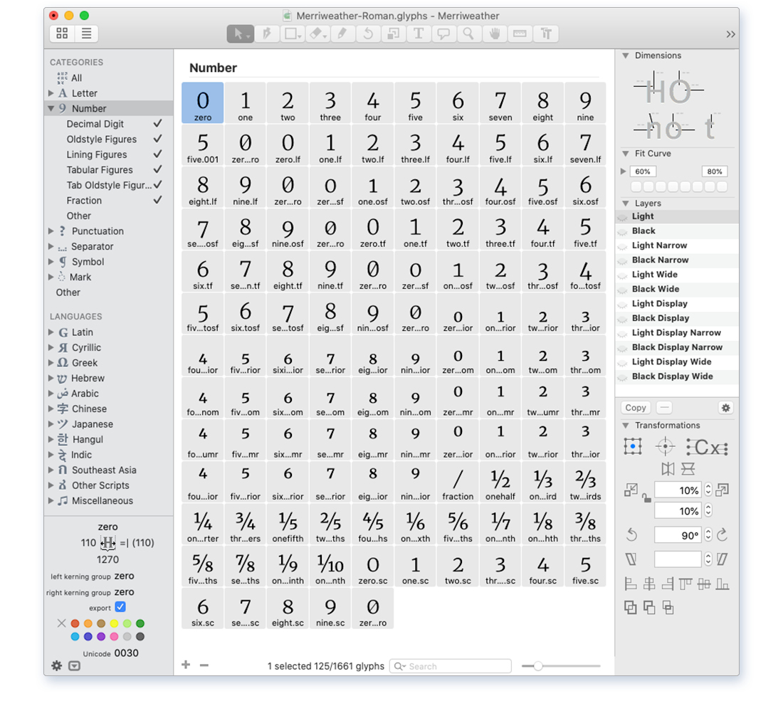
I was invited by Sorkin Type to contribute the numeric characters (lining, oldstyle, tabular, superscript, fractions, etc), across ten multiple masters. I created new design weights, producing and fine-tuning over 1,000 character forms. I tested and iterated designs as part of a consistent typeface, collaborating with around 15 team members working on the typeface in unison.
My approach
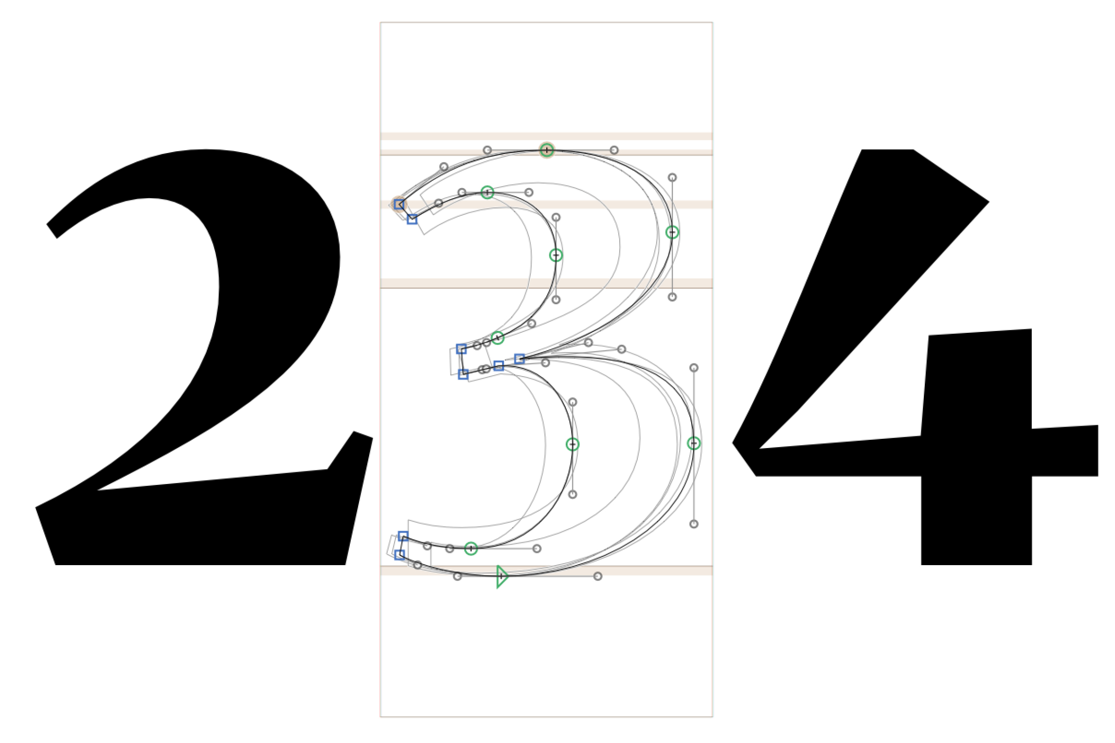
Working from the source files in existing font weights, I styled the extremes on two core axes: display-to-macro and black-to-light. These evolved organically by reflecting on the contrast and stylistic choices of similar forms. For instance, making comparisons between the curves and widths of the capital “B” and “3”.
By calculating the contrast ratio of ordinators and numerators in regular and bold weight, a scale can be devised to build a basic framework for black and light weights. These basic calculations were then stylistically adjusted for optical and stylistic effect to improve user legibility and readability by following best practice approaches, critical study analysis, experimentation and testing.
Once the extremes of the font were nearing finalisation, the additional weights within the multiple master could be built out using a plugin.
Importantly, key nodes that define the vectors of each form must be consistent in order for the variable font technology to work. For instance, a node cannot be removed for stylistic reasons, although it can be softened into a curve or concealed in a corner.
In parallel with my design evolutions, I was constantly receiving updates via GitHub from other team members. Importantly, everyone had to adjust their designs to ensure consistency of the overall product. For instance, it is very important that the numerals did not seem overly bold when typset alongside punctuation. Regular testing was essential.
Key outputs
Delivery of numerals with working multiple-masters according to production schedule, ready for inclusion within the overall font. These progressed alongside the contributions of the wider team to the next stage of the font production lifecycle. The launch of the font update was an important addition to the Google Fonts library. It places Merriweather at the forefront of text technology.